Claromentis Design
Claromentis Hubs
Claromentis Hubs

Overview
Sub-brand guidelines for Franchise Hub, Enablement Hub and Charity Hub, covering colour, gradients, icons, the umbrella mark and typography.
Brand architecture
The system has three levels. Keep them visually distinct so people can always tell which level they are looking at. Hub icons are always bolder than the rest of the icons representing organisations, industries, etc. A hub should not be represented with a plain line icon, unless inline at very small sizes where visual fidelity gets lost.
| Level | Visual weight |
|---|---|
| Claromentis | Master brand, unchanged |
| Individual hub | Bold, filled, colourful |
| Industries, Offerings, Organisations, Services, Use Cases, etc. | Light outline, one accent colour |
Naming
- Write the full name the first time: Claromentis Franchise Hub, never Franchise Hub.
- Always capitalise "Hub".
- In a list, use this order: Claromentis Franchise Hub, Claromentis Enablement Hub, Claromentis Charity Hub.
Logos
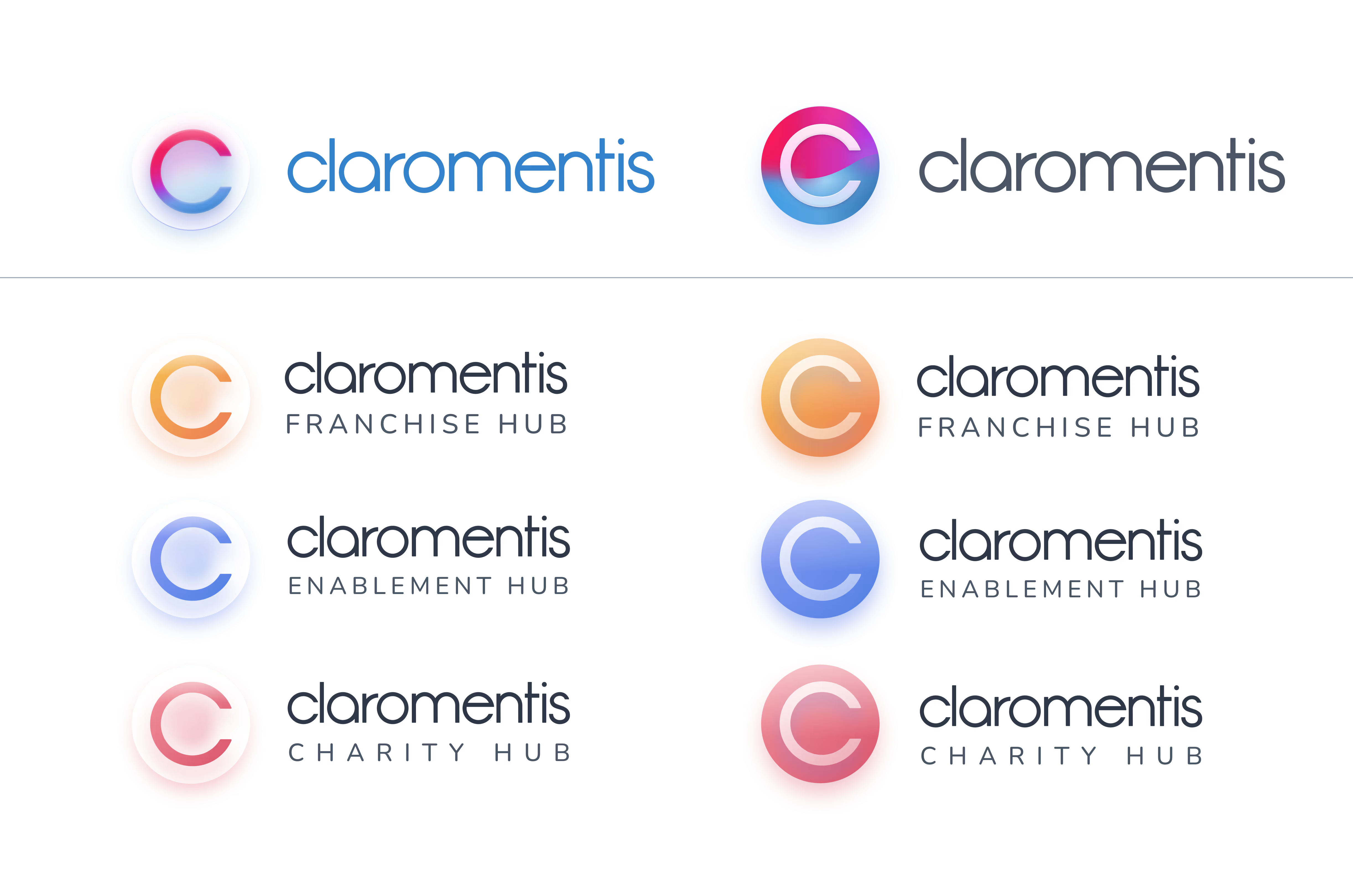
The Claromentis lettermark and wordmark identify the master brand, and each hub has its own sub-brand built from the same parts. Every logo comes in a light and a dark version; pick the one that keeps the logo clearly separate from whatever sits behind it.
Graphic elements
| Element | What it is |
|---|---|
| Lettermark | The Claromentis C set in a round glass disc. On the master brand it carries the full Claromentis gradient; on a hub it carries that hub's colour. |
| Wordmark | "claromentis" in lowercase. |
| Hub name | "FRANCHISE HUB", "ENABLEMENT HUB" or "CHARITY HUB" in uppercase with wide tracking, set beneath the wordmark. |
Always use the supplied artwork instead of rebuilding by hand.
Light and dark versions
| Version | Disc | C |
|---|---|---|
| Light | Frosted white glass, a soft tint of the brand or hub colour showing through | Ring in the brand or hub colour |
| Dark | Filled with the brand or hub colour | White glass ring |
Choosing a version
The aim is contrast between the circle and the background, so the mark reads as an object sitting on the surface rather than melting into it.
| Background | Version |
|---|---|
| White or pale neutral | Dark |
| Pale hub tint (page hero, menu tint) | Dark |
| Mid-tone or saturated colour (promotional card gradients) | Light |
| Dark plum (homepage hero and hub cards) | Light |
| Photography | Light, placed on a calm, even area of the image |